

⚡
Presentation
A comprehensive analysis of a restaurant’s data over a full month, turning sales and purchasing figures into clear decisions the owner can put into action immediately.
(The work is based on sample data to demonstrate the methodology, which can be applied to your restaurant’s actual data.)
What does the analysis include?
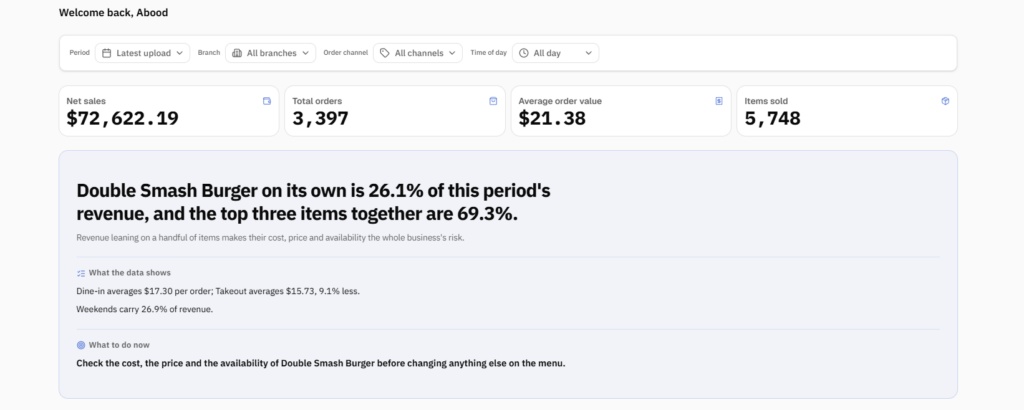
• Key performance indicators: net sales, number of orders, average order value, and quantities sold.
• Item performance: best- and worst-selling items, and each item’s share of revenue.
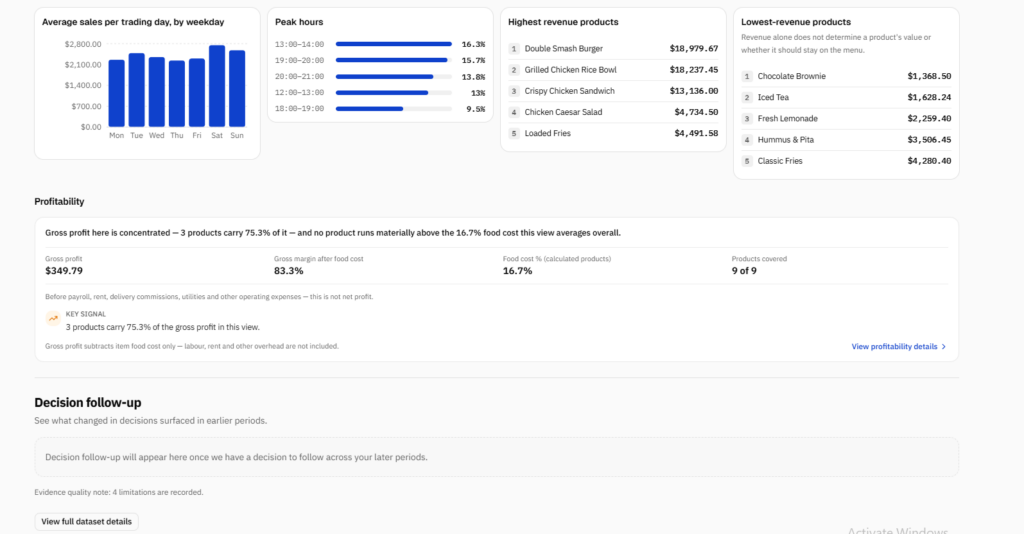
• Actual profitability per item: food cost calculated from recipes and purchase prices, and gross profit margin.
• Sales versus profit comparison: the best-selling item is not always the most profitable.
• Peak hours and strongest days of the week.
• Comparison by sales channel: dine-in and takeaway orders.
• Comparison across branches and time periods.
Examples of findings from the analysis:
• Just three items generate around 70% of revenue, meaning any change in their cost or price affects the entire restaurant.
• The best-selling item was not the most profitable, and its ingredient cost was the highest among the items.
• Average dine-in order value is about 9% higher than takeaway order value.
• The weekend generates around 27% of revenue.
What sets this work apart?
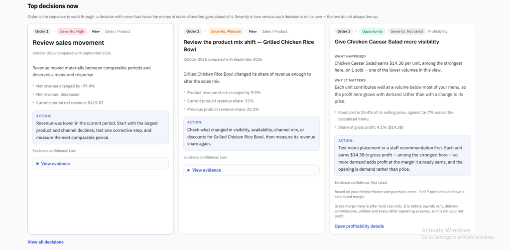
The analysis does more than display numbers: it presents decisions ranked by priority, explains the reason for each decision, and indicates the confidence level of the data. It also clearly explains the limits of each figure, such as the difference between gross profit and net profit.
Deliverables: an interactive dashboard and a concise report outlining the key decisions. The work can be done in Excel or Power BI, depending on the client’s needs.
(The work is based on sample data to demonstrate the methodology, which can be applied to your restaurant’s actual data.)
What does the analysis include?
• Key performance indicators: net sales, number of orders, average order value, and quantities sold.
• Item performance: best- and worst-selling items, and each item’s share of revenue.
• Actual profitability per item: food cost calculated from recipes and purchase prices, and gross profit margin.
• Sales versus profit comparison: the best-selling item is not always the most profitable.
• Peak hours and strongest days of the week.
• Comparison by sales channel: dine-in and takeaway orders.
• Comparison across branches and time periods.
Examples of findings from the analysis:
• Just three items generate around 70% of revenue, meaning any change in their cost or price affects the entire restaurant.
• The best-selling item was not the most profitable, and its ingredient cost was the highest among the items.
• Average dine-in order value is about 9% higher than takeaway order value.
• The weekend generates around 27% of revenue.
What sets this work apart?
The analysis does more than display numbers: it presents decisions ranked by priority, explains the reason for each decision, and indicates the confidence level of the data. It also clearly explains the limits of each figure, such as the difference between gross profit and net profit.
Deliverables: an interactive dashboard and a concise report outlining the key decisions. The work can be done in Excel or Power BI, depending on the client’s needs.
🖼️
Portfolio
📋
Background
🇬🇧English 🇲🇦Arabic
🕐
Working hours
Monday
From08h00To18h00
Tuesday
From08h00To18h00
Wednesday
From08h00To18h00
Thursday
From08h00To18h00
Friday
From08h00To18h00
Saturday
Closed
Sunday ▪ Today
Closed
⭐
Reviews
Please sign in as a customer to give your feedback
💬
No reviews yet.
Be the first to share your experience with this professional.